eCommerce businesses are not just about selling some products; they are about selling the whole experience. As people buy more things online, business owners need more innovative possibilities to improve the checkout user experience. People usually demand more alternatives to pay without a hitch. With the growing number of online payment options on the market, it’s a good idea to transform the final steps into a live and no-kicking procedure and tickle buyers pink of your selling platform.
Why Create a Seamless Checkout Experience?
It is critical for online store owners to pay greater attention to the creation of a seamless, effortless experience that attracts more new buyers and retains existing ones. You do not require a massive injection to drive your business into a wonderful, but you must provide your customers with something different from other shops.
Shopper satisfaction is your number one whilst running any enterprise. By making it painless for customers to complete their transactions, you can make people loyal and return again and again.
When you propose user-friendly checkout steps, you can optimize your conversion rate and elevate shopper satisfaction. A well-designed checkout stage can become a strong suit for your online business.
No diggity, more benefits of creating the upscale checkout venture is on the way. So, with a top-level checkout online experience, you can —
- increase your customers' satisfaction and loyalty,
- expand your client’s confidence and pleasure,
- and decrease the cart abandonment rate.
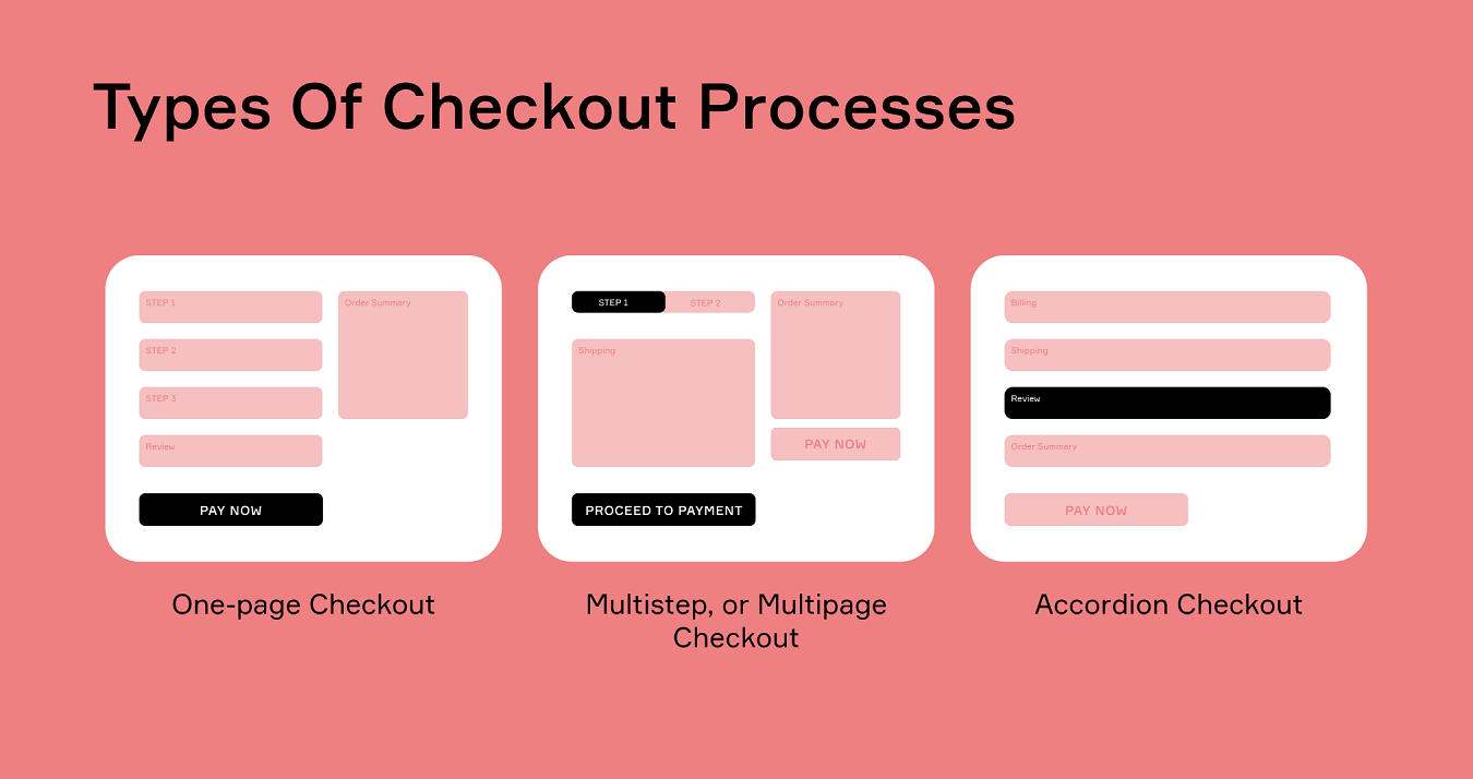
Types of checkout processes
Business runners can help their customers get their shopping finished quickly and efficiently on numerous occasions. There are plenty of modern working methods for you to help your customers stay happy and shop online with confidence. We want to outline three buzzy types of checkout processes and explain what makes them effective. We’ll also define when each type is most appropriate, as well as some tips on how to turn your online checkout experience into a no-sweat process.
One-page checkout
One-page checkout is an awesome option to shop. It's a one-page checkout venture, and it was created by Amazon. By saving time and getting more done, shoppers can spend more time on the things that matter to them most.
In one-page checkout, the regular buyer makes his/her selection and then is automatically taken to the next step, without the need for additional form filling. The checkout process happens in one fell swoop, and only the customer’s billing and shipping data are transferred over. Simple!
There are a few disadvantages to this approach, though. The first is that one-page checkout can be no picnic for some clientele to use. These customers may have some reasons not to understand the one-page checkout process, or they may simply leave the checkout process without completing it.
When buyers have to go through several pages, they may not finish the process. One-page approaches are most effective —
- on mobile devices,
- for buying low-ticket items.
Multistep or Multipage checkout
A two- or more-page checkout is like an extension of the one-page checkout, with additional pages for shopper payment data and shipping information. It’s helpful for customers who need to make more sophisticated choices, or when a store has multiple departments that require separate checkout processes.
This type of checkout is often referred to as a “multistep” checkout, as the different processes are often associated with different areas of the website. Businesses can collect more details from their customers throughout the multi-page checkout process. For example, this approach allows easy measuring of drop-off rates. After analyzing them it’ll be possible to drive actionable insights, e.g. at which stage users exit more often and why, and implement conversion optimization strategies.
The multi-step checkout process can be more effective for
- desktop devices,
- older segment customers,
- and less tech-savvy buyers.
Accordion checkout
Accordion checkouts are similar to multi-page checkout, but there are additional “wings” that expand this type of process. Items are selected and then paginated, with the possible options expanding from there. Accordion checkout is more about user experience and design. When customers use this form, for them the previous checkout step jumps up and collapses at the top, and the next step opens.
This type of checkout is helpful for websites with a broad range of products or a lot of data to load in one trial. Responsive websites can quickly scale up and down thanks to accordion checkouts. That is why buyers can easily change the data in the form fields without going back to the prior page.
The accordion checkout process is effective
- for encouraging customers to review the previous steps,
- and for allowing users easily correct the entered details.
Standard checkout process steps
Do you want to know how to improve the checkout experience? Check basic checkout steps and the problems customers may occur. Here are the steps of ordinary checking out:
Shopping cart
The first thing customers will see when they log onto their account at checkout is a shopping cart icon. They should click this icon to bring up the Shopping Cart screen. In the Shopping Cart screen, customers will see the items they have currently selected and an estimated price.
Billing information
After users click the cart icon, they will see a breakdown of the items they have selected, the total price, and the amount due. This information is based on the payment method and can vary from store to store.
Shipping information
After the checkout, customers may see a drop-down menu or blank table to fill out that will ask them to provide the shipping address. Different stores use different methods to ask for shipping information.
Shipping method
From here, users may choose the shipping method that will influence the shipping costs. Some stores offer free shipping to customers, but mostly there is a fee offered by various post services. It is essential to pay attention to this field, especially if buyers are interested in international shipping.
Preview order
After customers have selected a shipping method and entered their payment information, they can proceed with the checkout process by reviewing their order details. From here, they can see the items they will receive and view the chosen shipping options, plus the entire cost, and a breakdown of the actual cost. They can also see what shipping and taxes they will have to pay after the preview order is shipped. If they tap the payment button, they will sign into their account and proceed with their order.
Payment
After customers click the “Payment” button, they can enter their payment prospects, such as their credit card or PayPal account, or even pay with some cryptocurrency. Finally, shoppers confirm their payment.
TOP 3 mistakes to avoid for providing a seamless checkout experience
Each customer has a unique checkout experience. A poor mobile experience, slow site speed, a design that does not inspire trust, and unclear store policies are just a few of the issues that can cause a customer to drop out. How do the numbers look?
- A study conducted by Stanford University reveals that 75% of consumers judge the credibility of enterprises based on the design of their websites.
- In order to retain 95% of your consumers, you must provide the best online checkout experience.
- A study done by Akamai and Gomez.com affirms that 50% of web users expect sites to load in lesser than 2 seconds.
- In a 2019 survey by Unbounce, nearly 70% of consumers admitted that page speed impacts their readiness to buy from an online store, and 44% of them will recommend their problems to their friends, according to research by Optimizely.
Let’s consider the main problems in the checkout process that most customers meet.
Mistake #1. Lack of payment options
The lack of online payment options is one of the main checkout mistakes. When customers are unable to pay for their purchases, they often have a difficult time getting their orders processed. This can lead to a delay in the delivery of the product, and even a loss of the order.
To make sure that customers can pay for their purchases, it's important to provide a variety of payment options. And customers can choose the payment method that best suits their needs. Additionally, make sure to provide clear and concise instructions on how to pay for an order.
Mistake #2. Too many steps in the checkout process
When it comes to checkout, it's vital to keep it simple. Do not make your clients wait. Too many checkout steps can make the process challenging and confusing.
These mistakes can make clients’ checkout experience less enjoyable. So make sure to keep your checkout process as simple as possible, and your buyers are sure to enjoy their shopping more than ever.
Mistake #3. Hidden transaction fees or delivery rates
If you run a business online, it is necessary to be transparent about the enterprise payment options, delivery rates, and checkout process. Your purchasers will be able to understand what they're paying for and make informed decisions about whether or not to buy from you.
It's also noteworthy to be open about the fact that there may be some hidden transaction fees associated with your product or service. By being transparent about these fees, you'll help your customers feel confident about their purchase and avoid any potential surprises.
Best practices to create a stunning online checkout experience
Creating a seamless checkout experience is vital for any online enterprise. By using the right tools and techniques, you can create an online shopping venture that is both user-friendly and appealing. Here are a few tips to help you get started:
#1. Provide multiple payment methods
Online checkout systems allow your customers to complete their purchases quickly and easily. Plus, new payment alternatives are often more efficient and user-friendly than traditional checkout systems. Here are a few of the best ones:
- PayPal is a splendid option for online checkout. It’s easy to use and has a wide range of features. PayPal allows its users to complete their purchases, and pay with their debit or credit card quickly and easily.
- Amazon Pay is another outstanding choice for online purchases finalizing. Amazon offers buyers to pay with their debit or credit card.
- Google Pay (ex. Google Checkout) is one more widely adopted alternative for online checkout. It also allows paying with a debit or credit card.
- Apple Pay is the alternative to Google Pay for Apple users. And it’s a terrific choice for a secure and fast checkout experience.
- Visa/MasterCard and other credit card options can be one of the best traditional checkout solutions as well.
#2. Support multiple currencies
If you're running an online store, you need to support multiple currencies to create a seamless online checkout experience for your customers. This will help to reduce the amount of time it takes to checkout, and it will also make it easier for customers to make informed decisions before paying for their orders.
By supporting multiple currencies, you'll be able to ensure that your customers can purchase the things they need in the most efficient method possible. And, of course, it's vital to remember that customers should always be treated with respect — no matter what their currency is.
#3. Don’t surprise users with hidden charges or fees
One of the most reasonable ways to keep your customers happy is to use clear and concise checkout processes. Thus, your customers will know what they're buying and how much it cost.
Additionally, use effective and customer-friendly checkout forms that are easy to fill out and understand. Avoid hiding or pointing out any fees in the corner of the last page. No buyer will appreciate that. Remain clear and concise in terms of payments.
#4. Consider tax details in case of cross-border payment
Pay attention to the tax implications while offering products or services worldwide. To make sure all tax returns are filed correctly and you are in compliance with the tax laws, it is important to know what kind of tax system you are dealing with.
The most common types of tax systems are Value Added Tax (VAT) and Goods and Services Tax (GST). Each country has its own specific VAT or GST rates. In the EU, VAT is charged on goods and services. However, there are no VAT charges on digital products.
The UK has a value-added tax (VAT) which is charged on all goods and services. The US has no value-added tax, but they do have a federal income tax. You should always consult with a tax professional before offering any cross-border payments.
#5. Keep your checkout process neat
Keeping your checkout process neat and tidy can help create a seamless online checkout experience for your customers. This will help optimize the amount of time they spend on your site, and make it easier to process their payment details.
Corytech enables your customers with tons of payment options for their seamless checkout experience
Corytech is an innovative payment solution that enables your customers to make payments using various ways. With Corytech, business owners can accept payments through debit or credit cards, Google Pay, Apple Pay, and crypto. Corytech’s API is available for swift integration, and it's a lavish mode to enhance your checkout procedure.
Accept fiat & cryptocurrency in one system
Corytech is the perfect solution for anyone looking to provide online shopping payments with fiat and cryptocurrency. With Corytech, your clients can easily check out their items using their debit or credit card, and they won't have to worry about any of the hassle and inconvenience that comes with traditional online checkout systems.
Corytech is simple to use, secure, and safe, so your buyers can feel confident that their transactions are being handled with the utmost care. Corytech is the perfect way to sell online with fiat and cryptocurrency, and your customers can be sure that they are getting the best possible experience.
Find multiple currencies inside
Corytech offers your clients multiple currency options. With Corytech onsite, buyers can pay with various fiat currencies or cryptocurrencies like USDT, BTC, LTC, ETH, etc. Also, they don’t have to worry about conversion rates or currency conversions.
Plus, the checkout process is seamless and simple. So if your business is in need of a checkout experience that's easy and fun, Corytech is the nuclear option for you!
Fair transaction fees
Corytech is a new online payment service that offers fair transaction fees. With Corytech, you get transparent pricing, and zero hidden fees or lock-in contracts. That’s why you are saving a lot on payment processing.
Full transparency of the payment process
Corytech offers full transparency of their payment process for their seamless checkout experience. By using Corytech, you can be sure that your transactions are processed quickly and efficiently. This allows you to focus on your business and not worry about the back side of the process.
Corytech is the solution of choice for businesses that want to take their online value proposition to the next level.
Checkout Experience FAQ
How to improve the checkout experience?
There are many ways to improve the checkout experience. And one of them is by trying out new payment options and adding multiple currencies. Another way is by offering free shipping and returns on all orders. One more strategy is to provide the best customer service by responding to inquiries 24/7 and offering help with products that are not available in-store.
What are the top payment methods for a better checkout experience?
There are a number of different payment methods that can improve users' checkout experience. Some of the most popular online payment options include:
- Cryptocurrencies (including stable coins)
- Google Pay
- Apple Pay
- credit or debit cards (Visa, Mastercard, American Express, Discover)
What’s Next?
When a customer is going to buy your product or service online, they should receive a smooth checkout experience. Your buyers should be able to complete their transactions simply and transparently.
Corytech, as a payment gateway with cryptocurrencies on board, can help your business make the financial ecosystem more efficient by accepting diverse fiat and crypto payments. Use all product advantages while adding it to your online store, and your customers will value this option and come back one more time.
Ask for a free demo to see how Corytech can meet your customers' demands and enhance the online checkout experience of your business.


 Payments
 Solutions
 Industries
 Services
 Resources


